
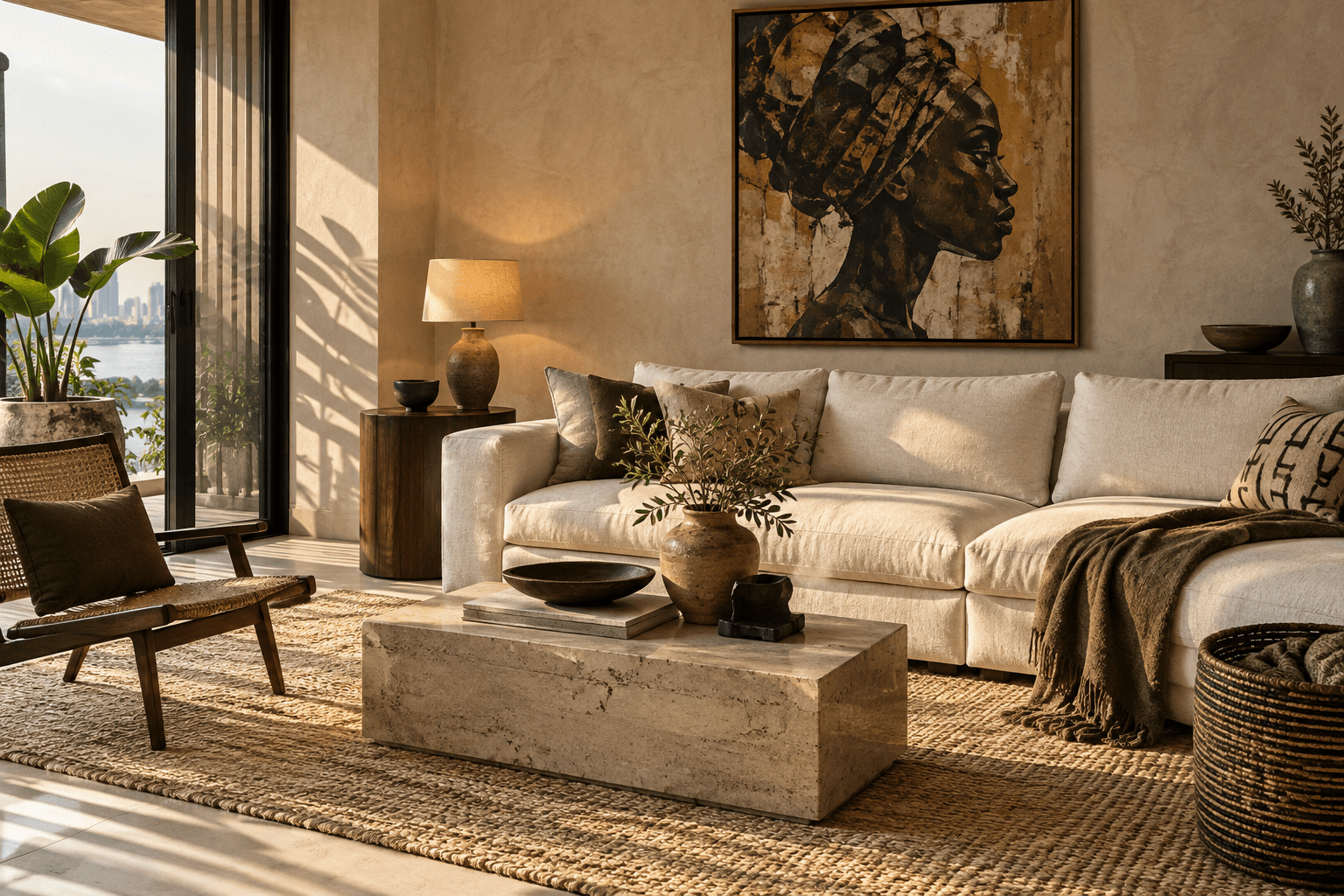
Neutral spaces can feel restful and easy to live in. They can also feel a little empty when everything shares the same tone, texture, and finish. The difference is often in the layers: the materials you touch, the contrast you notice, and the pieces that mean something to you.
Think in textures, not just shades
Ivory linen, a woven rug, matte plaster, and warm wood might sit in a similar colour family, but they each catch the light differently. That variety gives the eye something to enjoy without making the room feel busy.
Start with the larger surfaces, then add a few contrasting textures. A soft sofa beside a stone table or a smooth ceramic bowl on a wooden surface can do a lot with very little.
Give the room a little contrast
A neutral palette doesn’t need to be pale from top to bottom. A dark frame, a walnut table, or a charcoal lamp can help the softer colours feel more deliberate.
Try repeating one deeper tone in two or three places, rather than scattering unrelated accents everywhere. You’re creating a gentle connection across the room, not making every item match.
Let one colour become a quiet thread
If you enjoy colour, bring in a muted shade that you would happily live with every day. Olive, clay, or a dusty blue might appear in a cushion, artwork, or a favourite chair.
There is no requirement to use a particular colour because it is fashionable. Look at what you already reach for, and test a small amount before committing to a large piece.
Make space for things with a story
The most interesting part of a room is often something that couldn’t have been bought as a complete set: a piece of art, a book collection, a handmade bowl, or an object from a place you love.
Give those pieces room to be seen. A few things displayed with intention can feel more personal than a shelf filled just for the sake of filling it.